Why Delta Cafés?
Delta Cafés was the brand I chose for this project, guided by two main reasons. First, the undeniable kindness and vision of Mr. Comendador Rui Nabeiro, whose leadership transformed an entire region—promoting sustainable growth and supporting those who contributed to its progress. Second, my conviction that the brand’s visual identity could be elevated to further reinforce its legacy and better align with the values it represents.
Defining the Right Color Palette for Delta Cafés
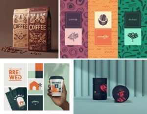
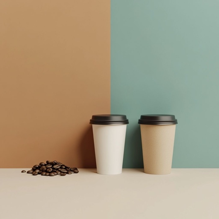
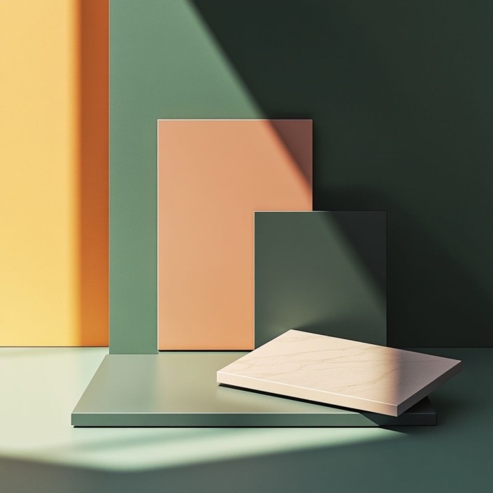
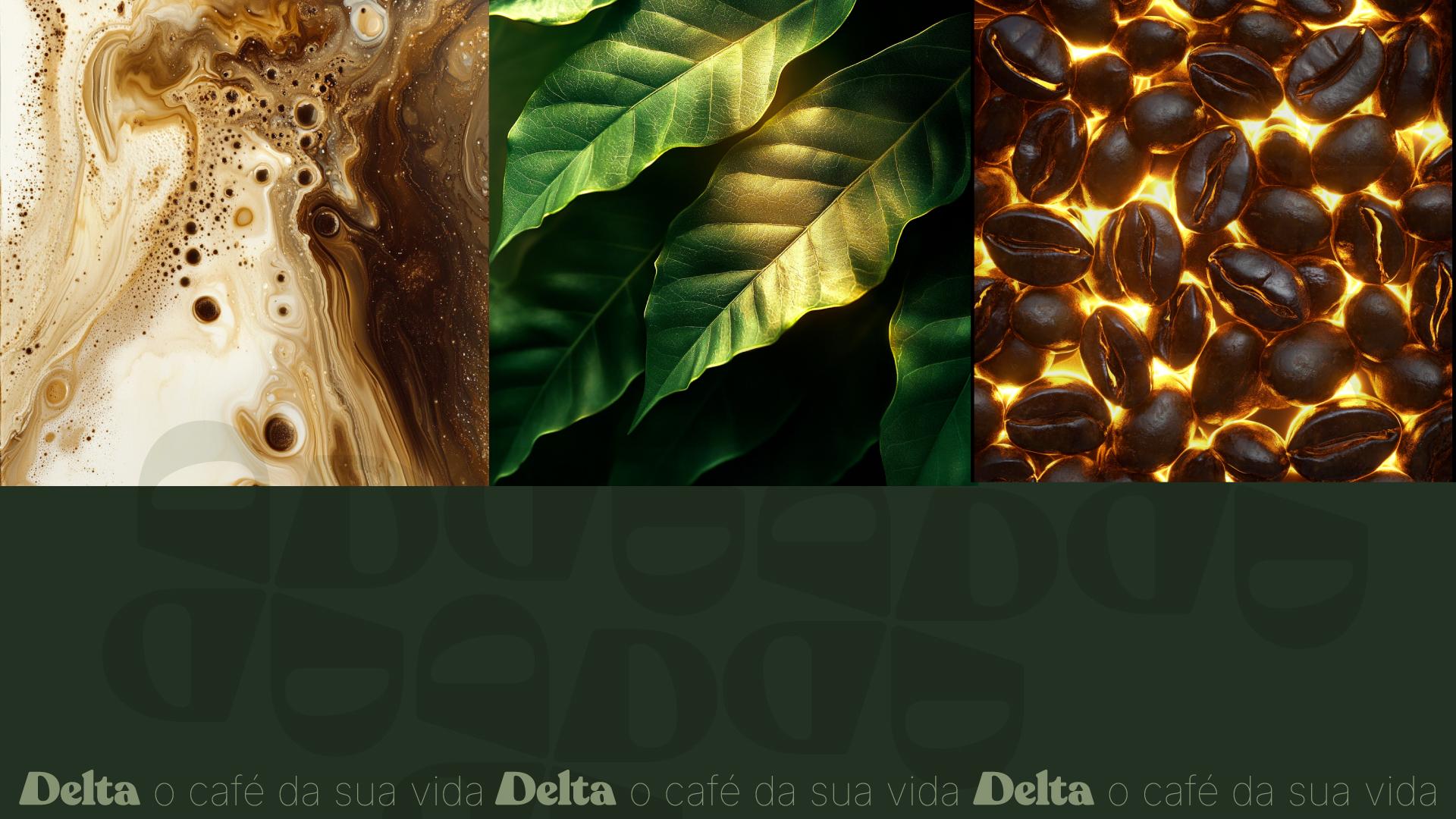
I gathered a series of visual references to serve as inspiration for the next stage of the project. The expected tones were inspired by nature—earth, leaves, water, charcoal—designed to convey purity, sustainability, authenticity, and a connection with the natural world.
Prompting the Palette
Context: Using the psychology of color and its meaning, I aimed to create a new color palette for the rebranding of Delta Cafés, a deeply rooted and historically significant Portuguese coffee brand.
Key Concepts: Trust, security, sustainability, nature, purity, flavor, and elements like leaves and coffee beans were central to this approach.
Desired Output: An image with the right tones to reflect the brand’s core identity.
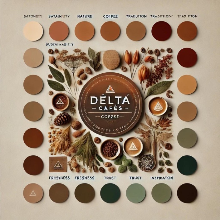
I used Colormagic to generate the palette. After several iterations, I arrived at a version that aligned well with the vision I had in mind.
Mockups & Visual Tests
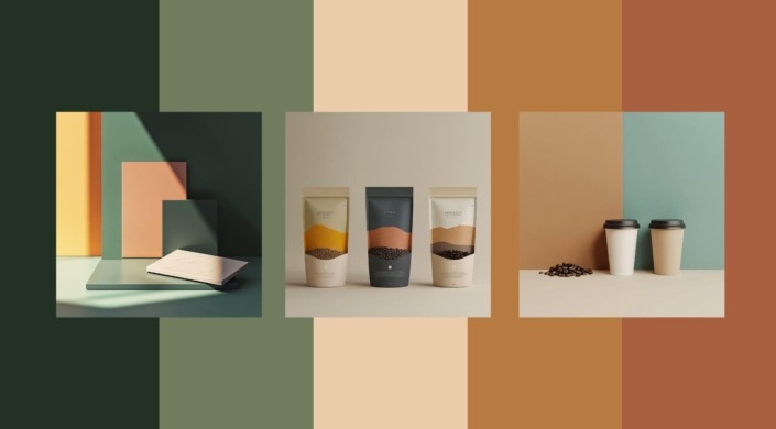
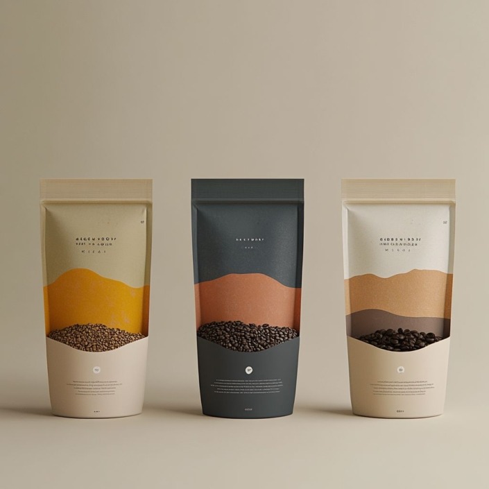
I then used Midjourney to create mockups using the selected colors:
-
#233123 -
#717C5F -
#EACBAA -
#B77A41 -
#A86040
Prompt Used:
“Coffee packaging using ONLY these colors: #233123, #717C5F, #EACBAA, #B77A41, #A86040”
The final results were visually coherent, though not exactly what I had initially envisioned. While the color palette’s quality was somewhat limited based on the reference image, multiple trials and refinements led to a balanced and satisfying outcome. The mockups exceeded expectations—some basic, others more refined—but they proved valuable in illustrating the versatility of layouts and visual scenarios.
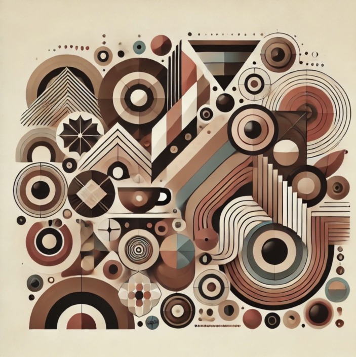
I also appreciated the visuals generated by ChatGPT, particularly when asked for an image using tones that would suit the brand. The image had a strong aesthetic, featured important elements like leaves and coffee beans, and even echoed the iconic triangular shape of the Delta Cafés logo—very impressive.
Typography Exploration
Prompt:
“What are the best typefaces for rebranding Delta Cafés? The visual identity should communicate modernity, trust, sustainability, nature, purity, and flavor. As a brand with a long history and strong social responsibility, it must also convey respect and seriousness. I need suggestions for a title font and a body font that work well across packaging, advertising materials, and digital platforms.”
Typeface Suggestions:
Title Fonts (Personality & Impact)
-
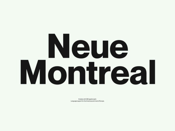
Neue Montreal – A modern, elegant sans-serif that conveys sophistication.
-
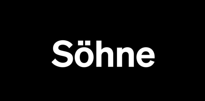
Söhne – Inspired by Helvetica, but with a more human and contemporary touch.
-
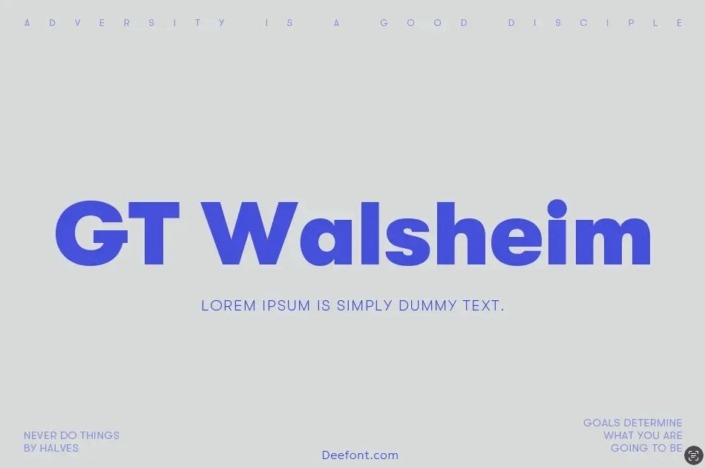
GT Walsheim – Clean, rounded, and accessible; balances modernity and tradition.
-
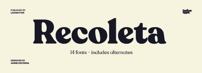
Recoleta – A contemporary serif that adds a classic touch without losing modern appeal.
Body Text Fonts (Readability & Balance)
-
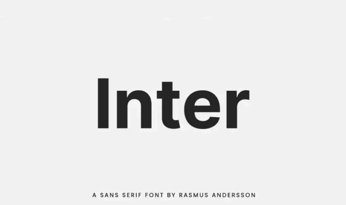
Inter – Excellent for both print and digital reading; highly legible.
-
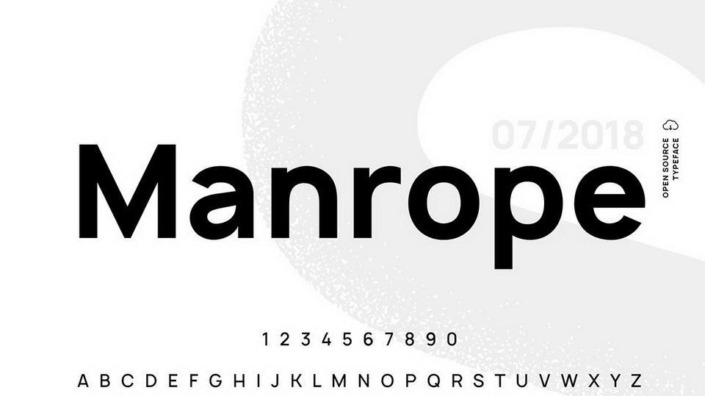
Manrope – Minimalist and modern, great for packaging and digital use.
-
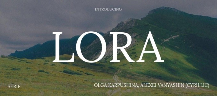
Lora – A smooth, elegant serif that brings a natural, organic feel.
-
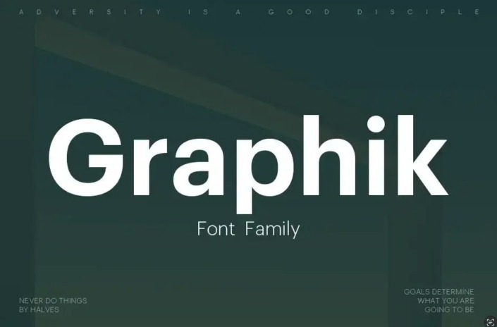
Graphik – A modern, functional sans-serif ideal for branding and ads.
After testing several combinations, I chose Recoleta for headings and Inter for body text. Since selecting between uppercase, lowercase, and different weights can be complex, I consulted Perplexity to support the decision, once I had framed it within the brand’s context.
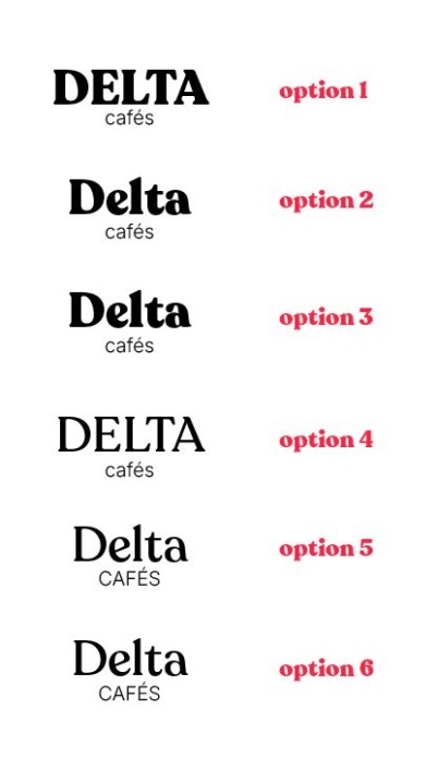
Final Typeface Recommendation – Option 3
After carefully reviewing six typographic options for Delta Cafés, Option 3 emerged as the best choice. Here’s why:
-
Balance of Tradition and Modernity:
This option blends classic elegance with modern simplicity. A serif typeface for “Delta” honors the brand’s deep roots, while a sans-serif for “Cafés” reflects innovation and contemporary design. -
Visual Hierarchy:
The bold, serif “Delta” combined with a lighter, sans-serif “Cafés” creates a strong visual hierarchy—highlighting the brand name while preserving legal and brand integrity. -
Legibility & Versatility:
The typeface maintains excellent legibility across various sizes and formats, from packaging to marketing to digital applications. -
Warmth & Familiarity:
Slightly rounded letterforms in “Delta” evoke a sense of warmth and closeness, aligning with Delta’s role in Portuguese society as a comforting and familiar brand. -
Unique Identity:
Option 3 avoids generic typography. Its distinctive combination of serif and sans-serif elements results in a memorable, recognizable visual identity. -
Respect for Portuguese Culture:
The typeface is sophisticated and strong, resonating with the cultural importance of Delta Cafés in Portugal. It honors tradition while embracing the future. -
Scalability for Brand Extensions:
This type system can adapt to different product lines and sub-brands, offering consistency while allowing creative flexibility.
Conclusion:
Option 3 perfectly encapsulates Delta Cafés’ core values—excellence, authenticity, tradition, and innovation. It respects the brand’s heritage while positioning it for future growth and global relevance. This typography will help Delta Cafés maintain a strong, distinctive identity that continues to symbolize Portuguese coffee culture at home and abroad.
LOGO
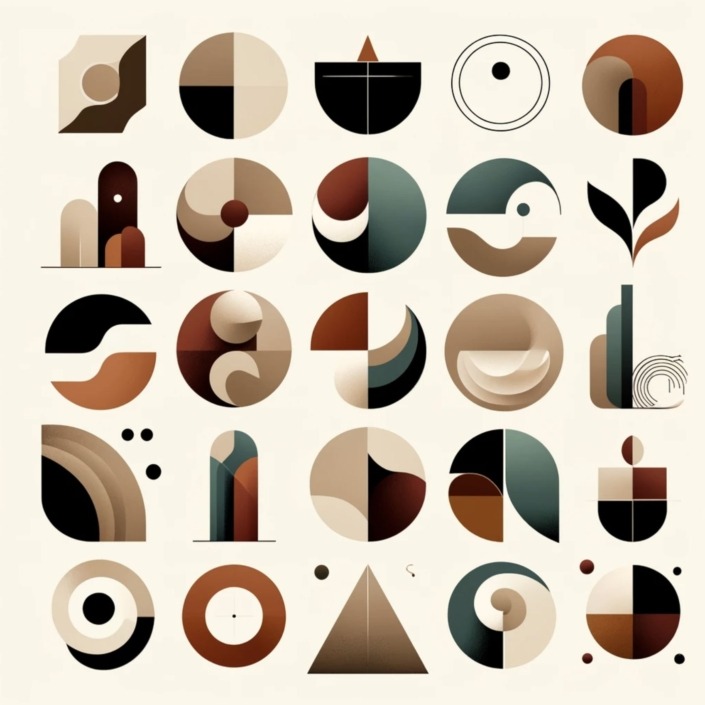
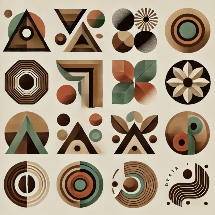
now I need images with multiple shapes and elements so i can inspire in the creation of Delta cafés logo rebranding and a small explanation of these shapes and forms.
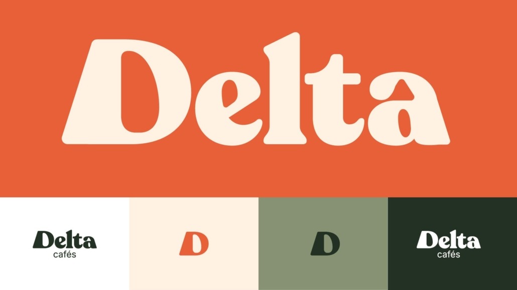
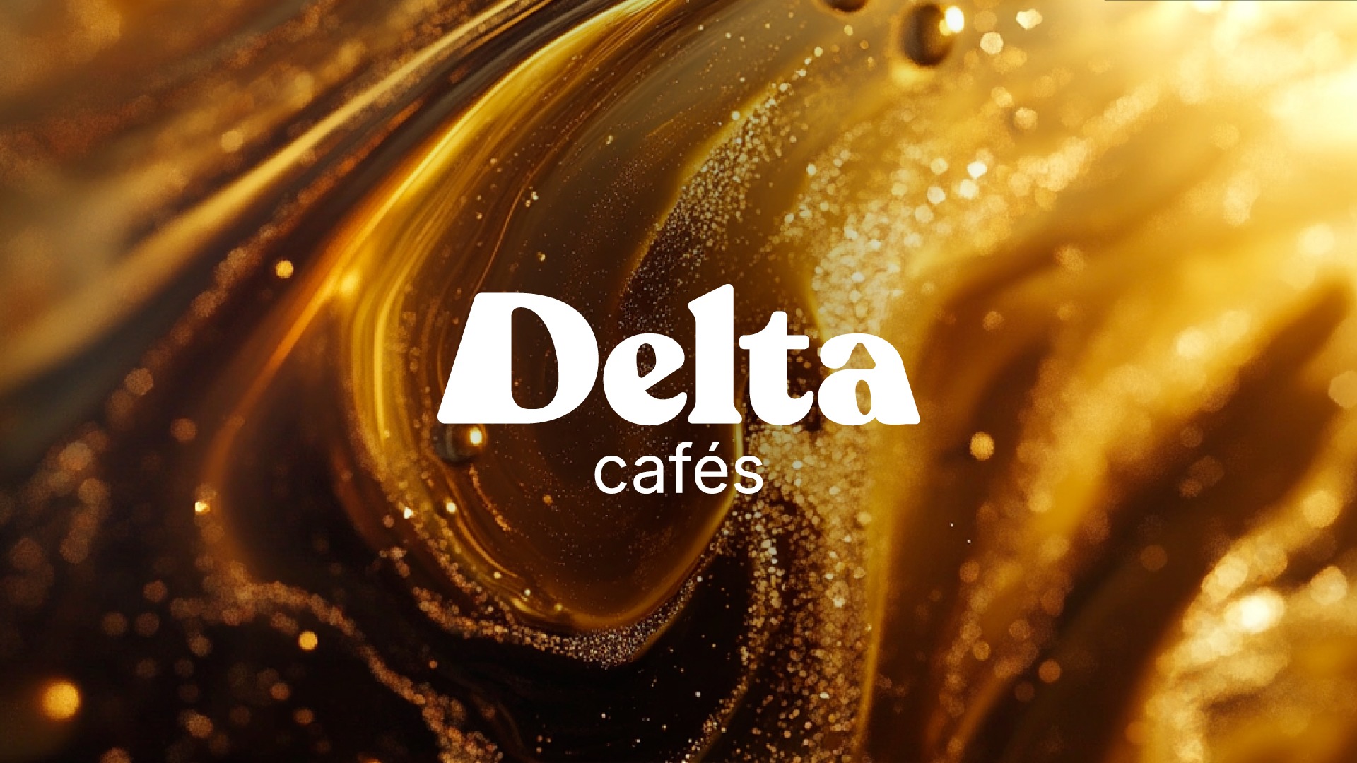
These variations inspired me to incorporate the triangle as a subtle typographic element
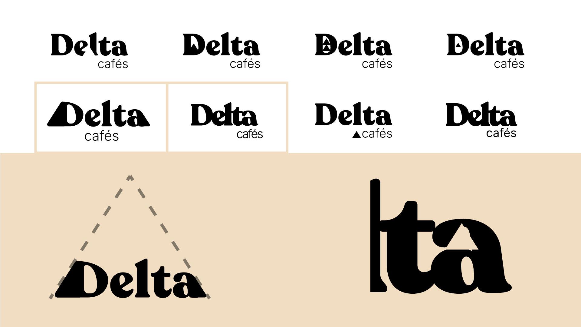
I began merging elements. As a rule, I prefer not to create overly complex logos. We have text, a coffee cup, and the triangle. In all previous versions presented, the triangle existed as an external element to the text, but I wanted a true fusion between form and typography. So I started exploring negative spaces, separations, and other modifications to integrate the triangle in a more subtle way.
After several tests, I concluded that two particular elements made perfect sense. Both triangular in nature – one cleverly embedded in the negative space of the letter ‘a’, the other more subtle, achieved through modifications to the first and last letters to create an ascending triangular impression. This latter form also cleverly suggests the shape of a coffee cup.
Following adjustments and synthesis of these two solutions, the outcome is presented below:
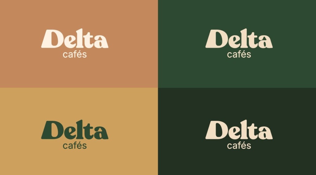
Since I wasn’t completely satisfied with all the colors in the palette, I made some adjustments. I wanted the primary color to be bold and contemporary. Delta’s original colors are red and yellow – so why not blend them to create a Terracotta tone, which was exactly what I’d envisioned from the start?
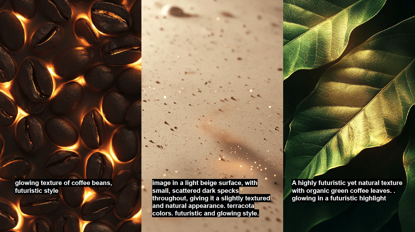
While exploring natural textures in Midjourney, I came across a background that caught my eye. I then asked ChatGPT to describe just the background of this image. The response: ‘Image is a light beige surface, with small, scattered dark specks throughout, giving it a slightly textured and natural appearance.
MOCKUP DEVELOPMENT
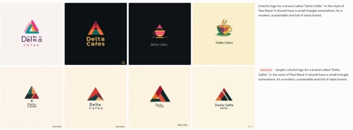
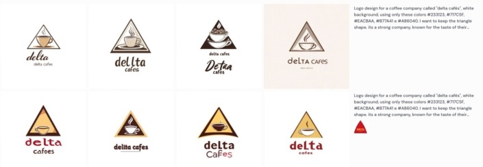
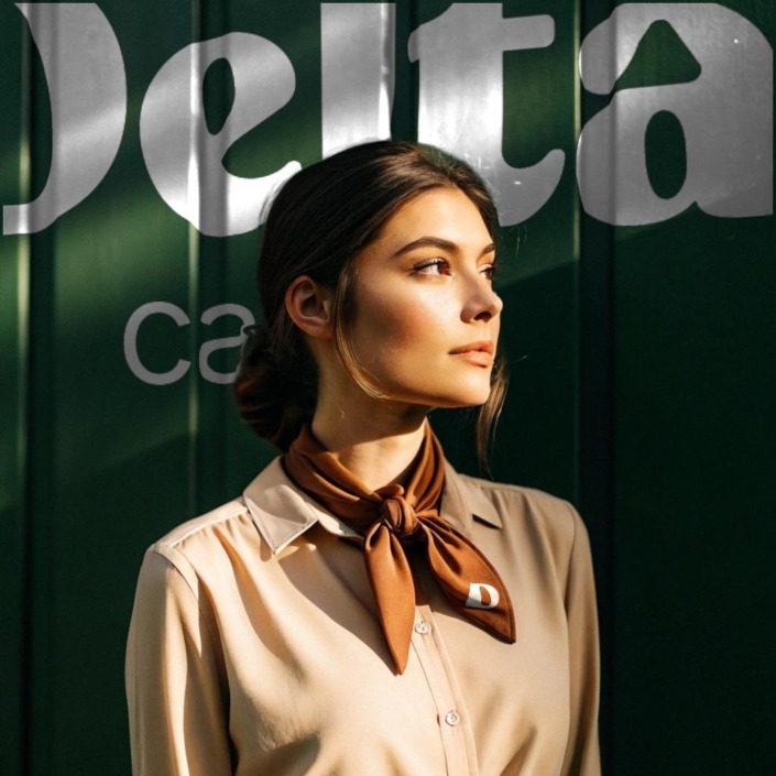
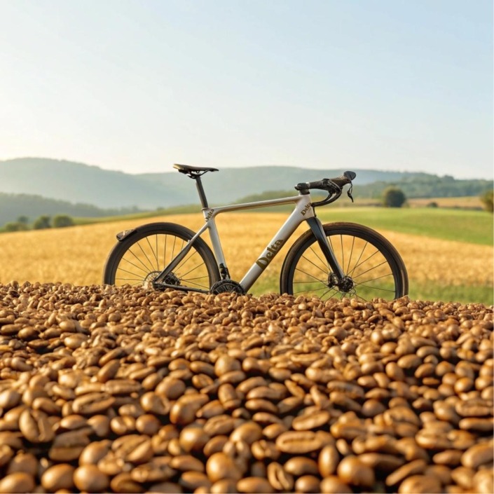
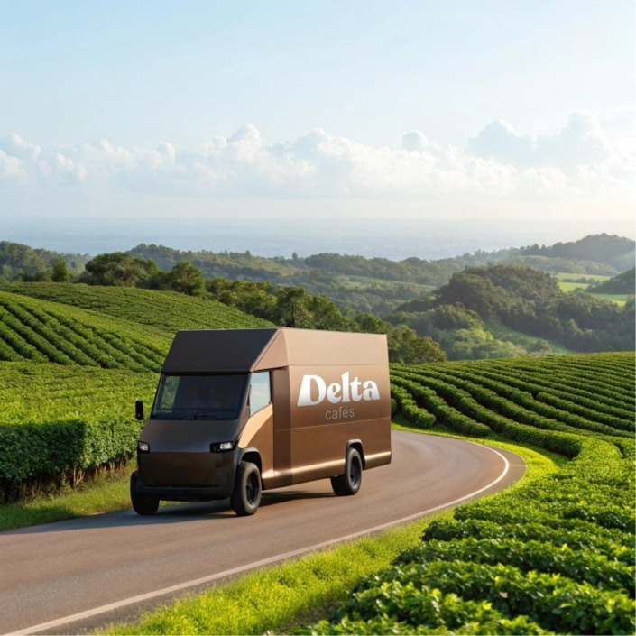
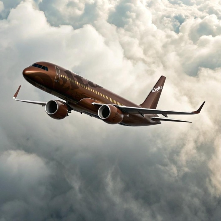
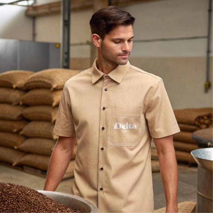
Created using Recraft AI. After numerous prompt refinements to adjust visual elements, we arrived at these final versions:
“There are projects we never fully connect with—ones that fail to spark genuine interest. But this Delta Cafés rebrand? A true creative adventure! From the outset, the goal was clear: honor the brand’s heritage while injecting modernity. And that’s precisely what we achieved. AI tools became invaluable accelerators—for color palettes, typography, even mockups. While most generated outputs weren’t immediately usable, each iteration refined the process.
Though no AI-generated logo made it to the final cut, every ‘unsatisfactory’ result contributed to a solution that truly served the brand. These tools excel at streamlining creativity, enabling direct exploration and rapid iteration. Rather than accepting raw outputs, I treated them as springboards—testing ideas, refining details, and curating solutions aligned with Delta’s values. The final identity emerged more cohesive, contemporary, and authentic to Delta’s essence.
Some promising early concepts were scrapped, while unexpected solutions emerged perfectly formed. Critically, I remain unconvinced by the secondary typography’s modernity, and the color palette required far more adjustment than anticipated. Yet the project’s speed and outcome? Absolutely exhilarating.”

